Hey Zoobsters!
Today we have Flavio, one of Zooba’s Product Managers, to talk more about update 3.0 and provide more insight on what it took to make it possible! This update was in the planning stages for a very long time and it took various teams to make it come to life! Below, Flavio shares behind the scenes of the first drafts to the final versions we ended up with.
Read more below!
Can you go over the entire process the team went through to come up with the 3.0 update features?
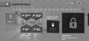
Our main premise was that we could make character progression be significantly deeper and more engaging. We know that Zooba players have a strong emotional connection with the characters, and our perception was that the current “character upgrade system” was a bit too simple. The main way to enhance a character was to “level it up”, but each level-up consisted basically of upgrading the same things repeatedly: damage and life points. We believe that Zooba has many opportunities to make character progression more interesting and compelling.
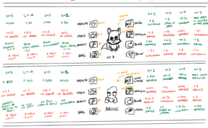
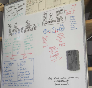
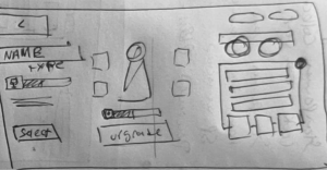
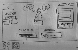
But of course, there are many ways to do that. So the first part was a deep process of ideation and brainstorming! And that went into various interesting (and crazy!) directions. I can share some of those very early-on drafts and sketches from this ideation process, made mainly by our Product Managers and Designers:
What did it take for the Zooba team to be able to release an update of this magnitude?
A huge load of work! 😀 This is definitely the biggest update we have ever made since Zooba was launched, and maybe even the biggest update that Wildlife Studios has ever made to a game that had already been successfully launched. This 3.0 version update involved literally all the disciplines in game development (Product Management, Visual Design, Art Direction, front-end and back-end Engineering, Quality Assurance, etc.). It started with a simple idea and it evolved into a workstream that involved more than 30 people for many months.
Can you share with us some images of the beginning stages of the 3.0 update?
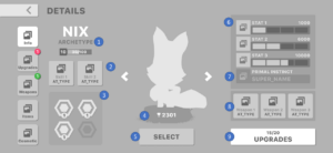
Sure thing! The process of exploration was one of the hardest parts, but also very fun. I’ll show you some of the progress and explorations made on three of the key screens for the 3.0 version: the “upgrade tree”, the “character home” and the “weapon attributes”.
Upgrade tree
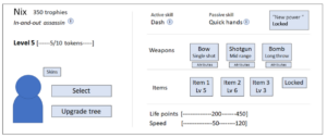
Below you can see literally the first (poorly made) draft of the idea. I literally made this on PowerPoint just as a first way to convey the idea for the rest of the team. The cool thing is that even though the final design (obviously) looks much better, a lot of the ideas of the basic structure were kept.
Upgrade tree – First conceptual draft:
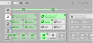
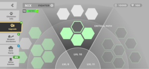
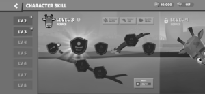
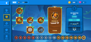
From the start we knew that this “upgrade tree” would be one of the most important parts of the whole project. So we took a lot of time to explore (and even brainstorm a bit more) in many different directions, as you can see below:
Upgrade tree – Mockups and explorations:
Upgrade tree – Final concept:
This is just the final concept – there might still be small alterations to the actual in-game version.
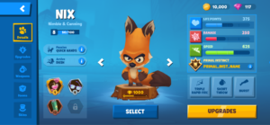
Character home
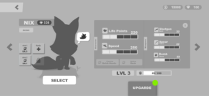
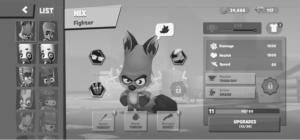
For this screen once again we started with a very simple conceptual draft, just to show what new features would have to be displayed in this screen (such as the access to the Upgrade Tree, the weapons’ Attributes, and the Primal Instinct – which at that point was just called “New power”). In the end, along the process, our visual designers decided that there was too much information to be displayed on a single screen, so they came up with the idea of the “tabs”, which are featured in the final version.
Character home – First conceptual draft:
Character home – Mockups and explorations:
Character home – Final concept:
This is just the final concept – there might still be small alterations to the actual in-game version.
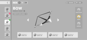
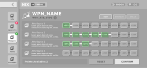
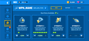
Weapon Attributes
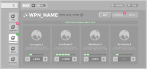
The weapons’ Attributes screen also had its share of exploration and trial-and error:
Weapons Attributes – Mockups and explorations:
Weapons Attributes – Final version:
This is just the final concept – there might still be small alterations to the actual in-game version.
Phew! I hope you had as much fun looking at all of those explorations as we did while writing this down and revisiting all this process 🙂
Which feature is your favorite that was introduced in the update?
That’s a hard question! I really like the Primal Instincts because each of them was designed with a deep thought about each character’s playstile, strategies, and even their lore and personality! So we had a lot of fun designing them. But I think I have to say that the weapons’ Attributes are my favorite feature because it will give players a lot of customization power, by making it able to customize each character exactly how they want to play them. It gives a lot of personality not only to the characters, but to each player to express their style.
Last thoughts and any comments you’d like to provide.
We made this update with a lot of care and love, and we really hope you can feel that while playing! Have fun, and see you at the zoo! 🙂
And that’s it, Zoobsters! We hope you enjoyed this special sneak peek into the process of making update 3.0 come to life! And a big thank you to Flavio for sharing all of these awesome images and details with us!
See you at the Zoo!

